| Home | | | Bio | | | Gallery | | | Free Watercolour Lesson | | | Events & Classes | | | Blog | | | Guestbook | | | Mailing List | | | Links | | | Contact |
WATERCOLOUR LESSON - refresher -getting you started lesson
Recently I attended a workshop that suggested the artists all buy a tube of Winsor Newton 'Light Red' watercolour paint. This granular terra cotta like colour was one I didn't regularly use and it has kind of sat around in my paint box for a while now. I thought I might get it out and try it as an underpainting for a sky and see what develops. I tried it in a beginner class and the results were kind of nice so I thought I might use it here.
STEP 1
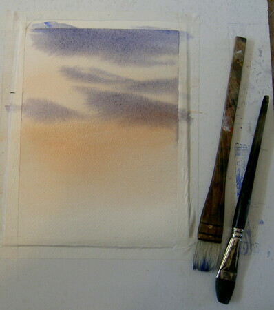
1. Using a hake or 1" flat brush cover your paper gently with clear water until it is evenly wet.
2. Mix up a fairly strong mix of light red (if you don't have this colour use burnt sienna) -it shouldn't look like weak tea, use enough paint to make a strong wash. You will be applying this colour on a wet surface that means you will be diluting it as you apply it so you want enough strength to make sure you only have to do this once.
3.Starting about 2/3 of the way down the paper stroke in your red mixture. Take the brush, dip it in your clean water, and go back to the wash in your palette and add the water, pick up the weakened colour and lightly stroke out the colour on the paper towards the top and the bottom of the paper. You are creating a graded wash.
4.When you have a pleasing soft base for the sky - dry it thoroughly.
5.Having dried the paper- you can now take a big soft brush, dip in clean water and rewet the dry underpainting. We do it this way to avoid lifting the red colour, when the paper dries it grabs the colour and holds on so that we can wet the paper and get ready for the next step.
6.Mixing the cloud colour- I used 2 mixes, ultramarine blue/burnt sienna/and a touch of permanent rose also indigo/permanent rose/ and a touch of burnt sienna. While the paper is still wet brush in strokes of colour in cloud shapes leaving lots of space between the strokes for the underpainting to show through. Tilt your board and let the paint run down the page and sideways, wherever you think you need some colour.You can keep adding darker colour into the wet washes as long as the paint is the same consistency as the drying surface. If you try to add really watery washes to a drying surface you will create blotches all over you sky.
STEP 2
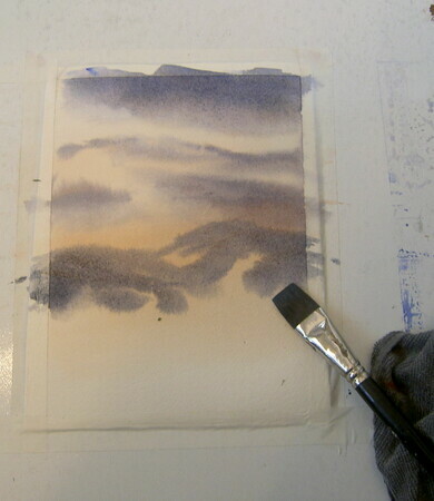
1.After painting the clouds in you can take a clean damp brush and pick up paint from the bottom of the clouds and the edges. This will lift highlights and soften edges.
2. Take those same strong grey blue cloud colours and intensify them a little by adding more paint. While the paper is still damp, broadly paint in mountainous shapes. Leave some areas darker than others so that it is an uneven application. We are trying for atmosphere (you pay big money for that in a restaurant).
3.Again you can keep adding darker colour in as long as you continue to thicken your mixes as the paint is drying on the paper.
STEP 3
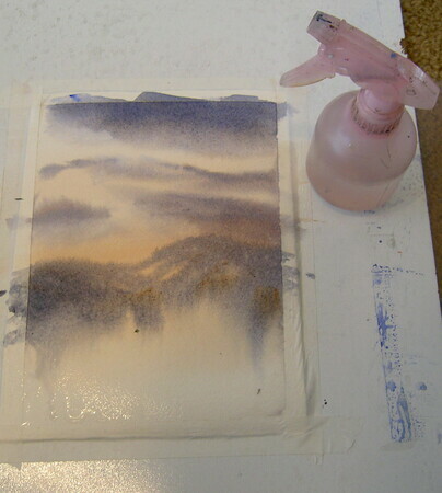
1.While the picture is drying take a spray bottle and mist the bottom of the mountain shapes-protecting the top part you have already done. The bottoms of the mountains will run and blend simoultaneously on the page- tilt your board upright to help with this process. Now dry the paper.
STEP 4
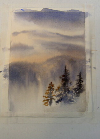
1.When the paper is dry take that spray bottle and spray the bottom right hand side while protecting the other part of the paper. When using a spray bottle you want one that leaves droplets of water NOT puddles. The droplets will attract the paint and leave a fillagreed lacy affect that keeps the application from getting too opaque.
2.Use the light red or the burnt sienna on the edges of your tree shapes being careful not to fill in all the little 'light holes' of the tree, changing to a smaller brush at this point is probably a good idea. The red colour is the light touching the thin edges of the tree and turning them a warm colour. Use a thick blue/grey cloud mix colour in the middle of the trees where light doesn't penetrate. Keep doing this until you are satisfied with the value of the trees. A light value will give the impression that the trees are far away while a dark value will bring them closer, creating contrast with the background.
3. In the bottom right hand corner drop in some of that light red or burnt sienna and then a little of the blue grey, don't fiddle with them just let them take on a textural appearance of rough grasses that are still a fair distance away(not too detailed)
STEP 5 (we're almost done)
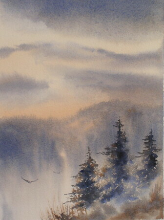
1.Your trees are drying and so is the foreground hill. Now take your small brush with thick dry paint and hardly no water and drybrush in some foreground grasses. Add some scratchy branches to the trees particularly in the upper branches. You can add small details forever but I added a couple of hawks flying off in the distance. Notice that in putting birds in the sky I looked for a light area of sky so that I wouldn't have to be heavy handed with colour to make the birds show up. Nothing looks worse than really dark birds in your sky- they look far too heavy to fly.
Ok - now quit sipping margaritas by the pool and get painting!
Hope this puts everyone in the mood to drag out their supplies- faith